The quick brown fox jumps over the lazy dog le 13-09-13
le 13-09-13
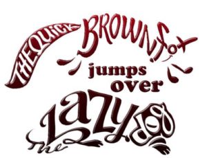
If you work in design you surely have heard, if not designed, this sentence, at least once.
It’s called a pangram – a sentence using all 26 letters of the alphabet – and it’s used to show how a typeface looks like.
This pangram is the most famous one, but surely not the only one. Hundreds of them can be found in various languages.
In English, their common point, besides having surrealistic evocations, is one recurring adjective “quick” as well as the adverb “quickly”.
So what’s all the fuss about speed? What links a “quick gloved jab”, a “quick frozen valium”, a “quick zephyrs blow”, a “quick jive form” and the notorious “quick brown fox” ?
Is speed a key component of the alphabet, of pangrams, of typefaces?
The etymology of “quick” tells us that this adjective gives “life” to something. Do these five letters, out of 26, have a special power on the rest of the pangrams? Is it the key word that gives life to pronunciation as well as typeface design?
To find out about this I asked a few designers about these quick and lively questions:
“It’s not for nothing that the word ‘quick’ gives so much points when playing crosswords” Johanna Roca answered. It’s hard to insert in the same sentence a “q” and a “k”; therefore “quick” appears to be the perfect word for this.
Memorability and impact is also “de rigueur”. A lot of pangrams can be found on the web but few try to evoke something.
“When showing a typeface in a witty way, that is readable, it will have more impact” Johanna added.
To choose a typeface, clients should therefore be able to evaluate the readability of it, naturally. So why not having a sentence that makes sense, something serious? Because, the shorter the better and the catchier the more memorable it will be.
If it’s assumed that typography can modulate the tone of a text, it is less obvious to think that the message has as much impact on typography.
In a nutshell, Pangrams give life to typography.
So, next time you have to create and sell typography, write it using a witty pangram, if no reaction is perceived, just drop your typeface for another one. If it triggers a positive reaction, you’re on the right way towards a successful design.
Illustration – Jean-Paul Lehfeld