Me gusta también! le 12-08-13
le 12-08-13
We recently came across the new logo of MEGA, a private Chilean TV network. MEGA was first introduced as Megavision (in October 1990) for the pleasure of all the Chileans. And the new MEGA identity, “I like” facebookers would say, but not the kaleidoscopic design, reminding the Melbourne logo, rather the way an old TV network became the people’s network with a playful language.
The more people and customers can “talk the brand”, the more the brand says “I’m yours”; and MEGA new identity is all theirs.
MEGA, rather ME GA, is a world of voices saying Me, mine and “Me gusta” (I like it). The fact that ME GustA has all the MEGA letters is another source of rejoice. It contributes to give meaning to this 80’s, 90’s, type of brand name focusing on performance; a time when we had the words Max and Power all over.
For this reason, the identity shift is interesting to note (the new identity was released in October 2010). It makes the brand more up to date as a new meaning is designed using a language approach.
As opposed to 8ta (we talked about in a previous post) MEGA started to develop a coherent messaging to show how people could talk the brand and spread the word; From the brand name, to the product and services.
To promote the iphone version “ME conecta, ME gusta. Entérate aqui” (I connect myself, I like it. Discover it here)
![]()
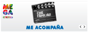
Or to stay close to the program grid “ME acompana” (it follows me)

One question, though. Did the agency have these ideas before or after visually splitting the name in ME GA? Before would mean the copywriter was smart to create a language and not just a name, after would mean the designer had a great intuition putting back to work the copywriter.
In both case it helped to create an interesting verbal identity, not the most developed one yet, but one that gives a depth to the brand, that is nice to see, to hear and playful to use, Claro que me gusta!
And here is the logo generic
Me gusta también !
